If you have a Google Search Console account, then you may well have seen a new notification appearing in the last few weeks, similar to:
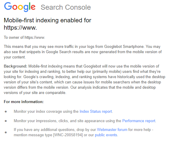
That’s right, Google’s mobile-first index has finally arrived. Or at least, it’s begun to progressively roll out, which means that it’s never been more vital to have a mobile-friendly website.
What is Mobile-First Indexing?
For many years, Google’s way of crawling, indexing and ranking has prioritised the desktop version of a website, but that’s no longer the case. With mobile browsers now in the majority, desktop sites vastly different to their mobile versions generate too many issues relating to user experience. Hence, the mobile version of any page is now the first port of call for both indexing and ranking.
To clarify, Google does not have a separate “mobile-first index”; it’s simply the case that mobile content is now the starting point for their index ahead of desktop versions, which hasn’t historically been the case.
So, with all that in mind, what exactly is changing for you?
For many websites, it’s business as usual. Nothing changes for you if:
- Your website is desktop only and possesses no mobile-specific version.
- You already possess a responsive website (well done!).
- Your web pages are all created in AMP HTML.
However, the mobile URL, content or version of your site will now be used for indexing if:
- You have an m-dot website with separate URLs that exhibit mobile-optimised content.
- You use dynamic serving to tailor your content based upon a browser’s device.
- Your site has both AMP and non-AMP versions of pages.
In a nutshell, if your site possesses content that appears differently on mobile browsers than it does on desktops, then you’re going to need to adhere to Google’s best practices. These include:
- Checking that content and meta-data are identical on both mobile and desktop sites.
- Utilising structured data that includes the mobile URLs on your mobile site and vice versa.
- Submitting both mobile and desktop versions of your site to Google Search Console.
- Making sure your servers are capable of handling increased crawl rates on mobile sites.
- Checking that robots.txt directives work for both mobile and desktops versions of your site.
- Ensuring that your XML or media sitemap is accessible from your mobile site.
- Having your mobile URL hreflang link elements pointing to mobile URLs, and vice versa.
- Having rel-canonical and rel-alternate link elements correct for mobile and desktop.
- Maintaining social metadata, OpenGraph tags and Twitter cards on both site versions.
Google’s “Mobile-First” Doesn’t Mean “Mobile Only.”
Although the first few waves of Google Search Console notifications have been rolling out over the last month or two, there’s still no need to worry if your own site hasn’t been included in this initial wave. The mobile-first index relates to gathering content, not how it is ranked, so if your website already contains mobile content, but your Search Console account hasn’t updated, you’re not at a disadvantage. However, having mobile-friendly content definitely is important for search results performance. If your site only has desktop content, it will still be indexed, but it may now need to be extremely relevant indeed if it’s to be ranked ahead of faster-loading, mobile-friendly content.

So, What Should Your Mobile SEO Strategy Be?
The bottom line is, it’s extremely difficult – if not impossible – to be certain about how this will influence future SEO strategy. After all, the need to consider mobile-friendliness has been a factor for some time, so little is changing there. However, there is a growing theory that Google is steadily moving away from a dependency on HTML URLs and traditional links when it comes to ranking factors, while other methods like structured data are growing in prominence. It’s definitely true that mobile content tends to have fewer links than desktop content, but does this mean that it’s now viable to claim that “links are dead”? The jury is still well and truly out on this one. Nevertheless, to futureproof your website, your mobile SEO strategy should be well-rounded, if it’s not already.
Top Tips from SQ Digital
If you’re looking to thrive in a mobile-first index world, then the best pieces of advice we can give are to:
- Invest in a mobile-optimised site that adheres to the principles of responsive web design. A responsive website removes the risk of error, which can easily occur with other mobile implementations (such as a separate mobile site). It ensures that your desktop and mobile content are identical page-by-page. If a competitor of yours has a mobile-friendly site, and you don’t, in all probability, they will outrank you.
- Install an SSL certificate onto your website if you haven’t done so already. This tip may not be mobile-index specific, but Google will always attempt to index HTTPS before HTTP, regardless of index type. Also, as of July 2018, Google Chrome 68 will begin flagging all HTTP sites as ‘not secure’. That’s bound to have an impact on how trustworthy your brand is perceived as being, and you may sacrifice ranking potential by forgoing a move to HTTPS. If you haven’t yet migrated to secure HTTPS, you should do so now.
- Make certain that your website’s speed is up to scratch. Speed is paramount for mobile browsers (the relatively recent arrival of AMP pages demonstrates this), and there are plenty of user-friendly tools to help you gauge where your site currently stands. If you’re giving up ground in terms of site speed, you need to address this.
- Pay attention to the backend of your site. Ask your developers to do whatever they can to improve server response times, leverage browser caching, remove superfluous redirects (and redirect loops) and enable efficient compression.
- Consider your UX. Remove any hover elements on your website: mobile controls for these are not yet developed. Negate the use of Flash: many devices are not compatible. Avoid the use of carousels. Where possible, dispense with pop-ups or large image graphics that are likely to slow a user down. Make certain the design of your site is “finger-friendly”, with around 44 pixels of space around clickable elements. You can test the mobile-friendliness of your site using Google’s own tool.
- Revise your thinking. Google’s Gary Illyes was quoted some time ago saying, “in the mobile-first world, content hidden for UX should have full weight”. Interestingly, the historical pattern that page elements behind accordions carry less weight should now be different. Mobile users tend to be less attentive and more easily distracted than desktop browsers, so UX techniques such as accordions, anchors, tables of contents and the like need to become the norm on your website.
- Invest in an SEO strategy that prioritises what Google prioritises and moves with the times to cover the approaches growing in prominence, such as structured data.
If you want to know that your website is mobile index ready, please fill out our contact form. One of our experts will be happy to offer you a free audit and discuss an SEO and digital marketing strategy fit for mobile-first market space.