
We’ve seen technologies change rapidly over the last two decades; attitudes have shifted, and marketing techniques that were effective just a few years ago are now considered outdated. To keep up with the fast-paced world of digital marketing, we need to be willing to adapt and get on board with all the latest trends.
At SQ Digital, we’ve been developing and honing our marketing expertise for over two decades now, and as we celebrate our 20th anniversary, we thought we’d take a look at how websites and web design have changed since we first started back in 2000.
The Importance of UX and Design
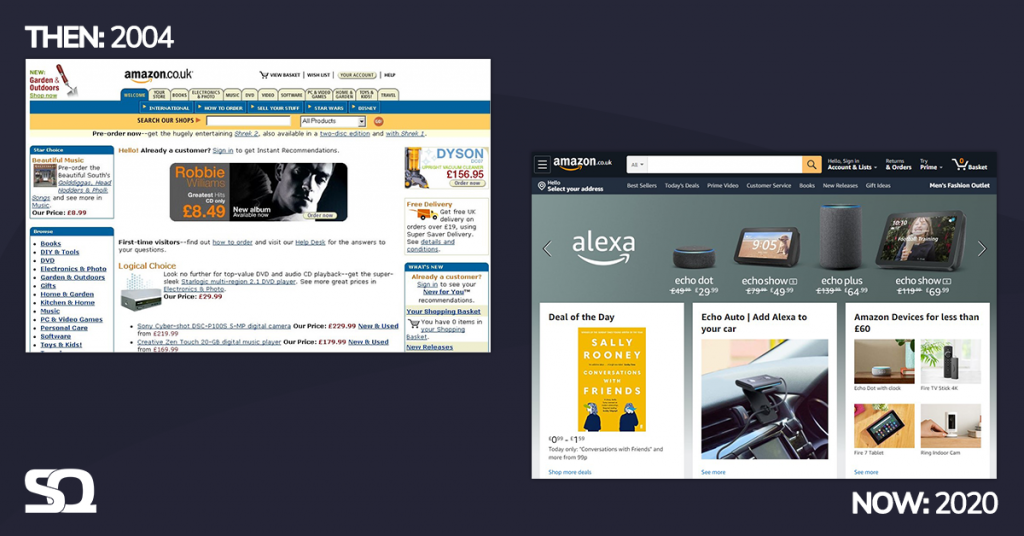
Website users are much savvier than they used to be in 2000, and usually don’t stick around on a website that’s difficult to use, messy-looking or complex. UX (User Experience) and design have become crucial elements for any website. We’ve become so used to glossy, innovative web design created with users in mind, that it’s easy to forget that things weren’t always that way. Even some of the biggest internet giants like eBay and Amazon used to have a very basic web design that’s a million miles away from what they have today.
The increase in the use of graphics and visual elements has introduced some of the most significant changes. Early websites were very text-heavy, using only basic HTML. We now use many coding languages, like Java and CSS, to help us create much more visually appealing websites.
Advances in online tracking mean that whenever we browse the internet, algorithms are learning about our individual user experiences, customer journeys, browsing habits, motivations and values. All of this information allows us to build customer personas, which in turn help us to understand the types of people who are searching for a particular product or service. Websites are now designed with this data in mind to ensure they attract the right visitors.
In the early days, all we needed to consider was how a website looked on a computer monitor – that’s all changed. The vast range of devices we now use to browse the internet has also been a big driver behind the design of websites. Search engines are used more frequently on mobile devices than on a desktop, so designing a site suitable for phones is more important than ever. Now, a good website needs to work just as well on a mobile as it does on a laptop. This is what we call responsively designed websites.
Putting Mobile First
Mobile internet surpassed desktop usage in 2016, and people spend far more time browsing the internet on their phones. This explosion in mobile browsing means designers must always consider what types of devices are most likely to be used to access the sites they’re designing, enabling them to create a more user-friendly experience.
The ‘mobile first’ approach starts with mobile website design because designing a website around mobile users brings a few more challenges with it. Once the designers have overcome the mobile-based restrictions, the website can then be expanded into a desktop version.
Mobile usage has also meant that designers have to take into consideration the aspect of touchscreen technology. Most users are no longer using a mouse to navigate a web page, and web designers need to ensure that they’re designing with touchscreens in mind. This means they need to consider natural hand gestures, the action of tapping and typing, and how easy it is to interact with on-screen elements.
And crucially, of course, users expect their web browsing to be just as quick on mobile as on a desktop or laptop.
Speed and Optimisation are Crucial
Every year, more and more people gain access to the internet. There were approximately 361 million web users worldwide in 2000, compared to an incredible 4.57 billion people as of 2020. With such a massive increase in online traffic, maintaining high speeds becomes a real challenge. If a page loads too slowly, users will simply click away.
Also, with the increase in on-site visual elements, there are now more things that can slow a website down. Designers need to make sure images are optimised, the developer’s code is clean, and server response time is minimised, as it all adds up to give the user a fast and seamless browsing experience. There’s no point having a fantastic looking website if it takes far too long to load up.
The Rise of E-commerce
E-commerce has become so integrated into our lives that it’s difficult to imagine life without it. But it wasn’t that long ago that it didn’t exist. You can find the roots of e-commerce in teleshopping, where the connection of television and telephone lines gave viewers a way to place orders. With the arrival of the internet, this shifted online.
No longer just a place for users to find information, many company websites now offer a platform for users to makes purchases of goods and services thanks to the implementation of e-commerce. With more and more people doing their shopping online every year, web designers have put a considerable amount of focus into designing e-commerce platforms that are easy to use and secure for users.
The Switch from Outbound to Inbound Marketing
Inbound marketing has replaced the more traditional forms of advertising. Outbound strategies like cold calling, door-to-door sales and printed ads have dropped in popularity, and inbound marketing has grown to embrace the digital age in response to the shift in customer behaviour.
It started with pay-per-click advertising in 2000, and social media platforms quickly followed, giving rise to channels for businesses to promote their brands. The likes of blog writing, podcasts, videos and eBooks are just some of the ways companies create engaging content to draw in customers.
From a dedicated blog page to personalised video content, and even chatbots that enable customers to connect with businesses, inbound marketing is in a constant state of change depending on consumer demand. Web designers are always adapting and keeping on top of these changes in their website designs.
The websites of 2000 are a world away from today’s websites, and that’s a good thing. They’re far more intuitive, faster and feature so many more elements to help market your products and services to consumers.
SQ Digital is a web design agency that’s been at the forefront of the industry for 20 years. Whether you’re looking for a simple website to help promote your brand or an entirely bespoke site to open your products or services up to a worldwide customer base, we can help. Contact us today to find out how.